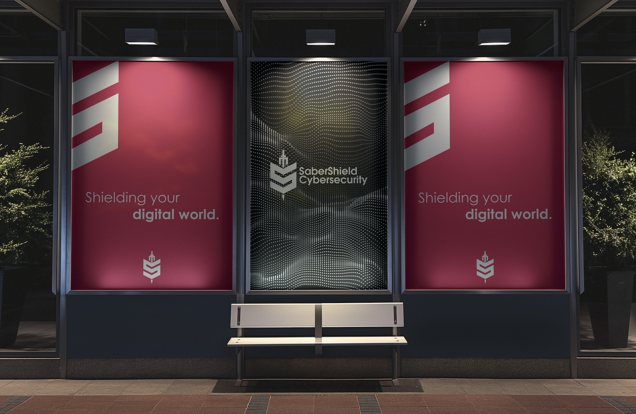
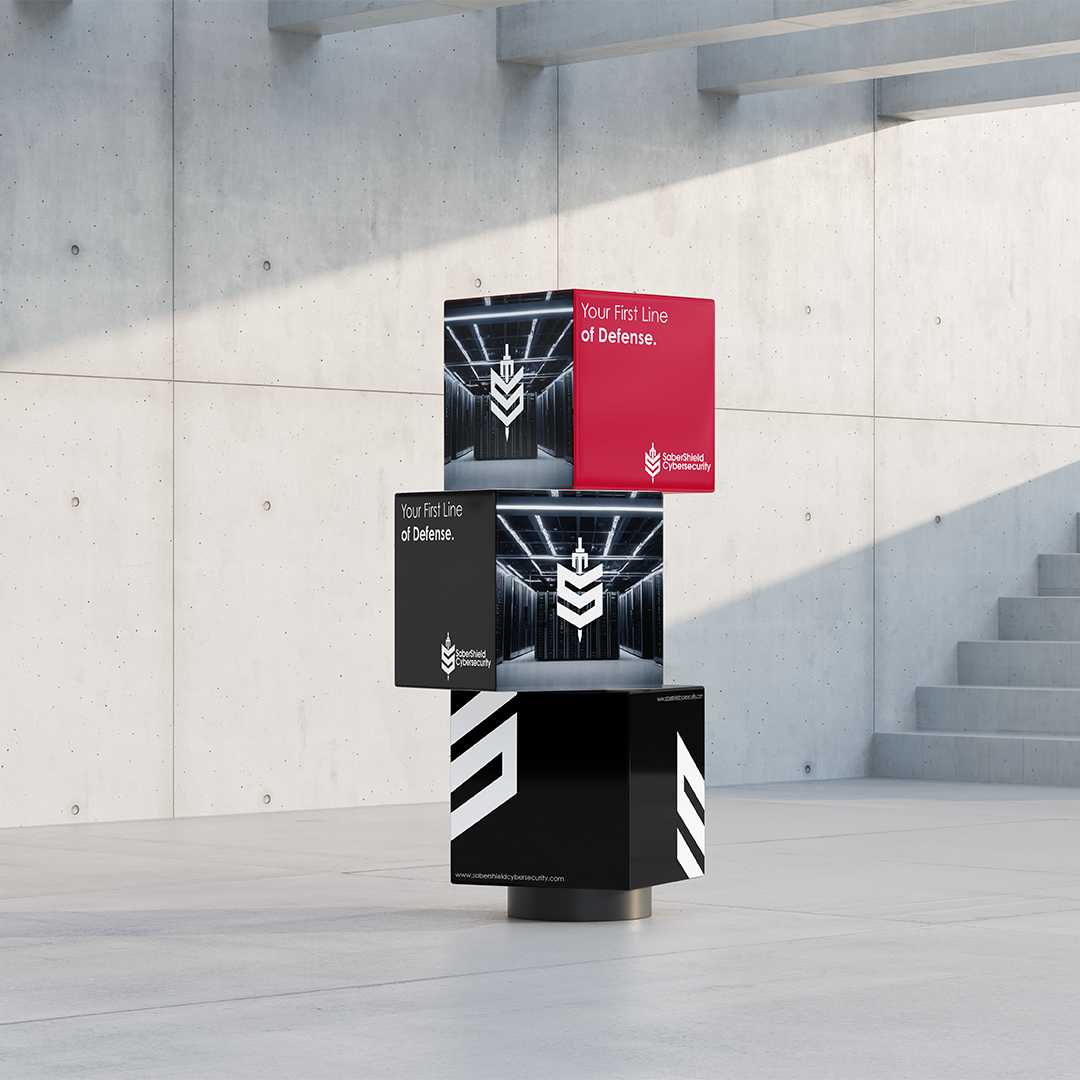
SaberShield Cybersecurity
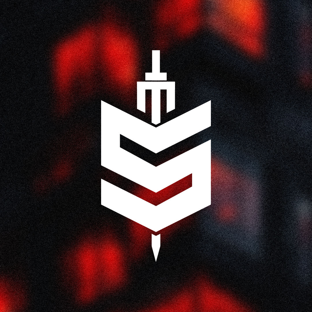
SaberShield was my first opportunity to turn an idea into a real brand for a real client. I approached the logo as more than just a visual mark. It was about finding the right balance between symbolism, clarity, and purpose while creating something that could represent trust and security.
The shield became a symbol of protection, while the hidden “S” and saber shape added depth without being too obvious. Every decision was made carefully to show strength without feeling aggressive, protection without fear, and simplicity without losing meaning. This project shaped how I approach branding today by focusing on intention rather than decoration.